In the age of AI and constant communications, brand consistency matters more than ever. This refresh focused on three main pillars, which were modernizing and simplifying the visual identity, unified presentation across every touch point, and re-positioning every single action as a reflection of who the company is at its core.
First, we refined the company logo. By removing the line, adjusting alignment, and eliminating the horizontal stroke, the updated version is more modern and versatile across numerous platforms.
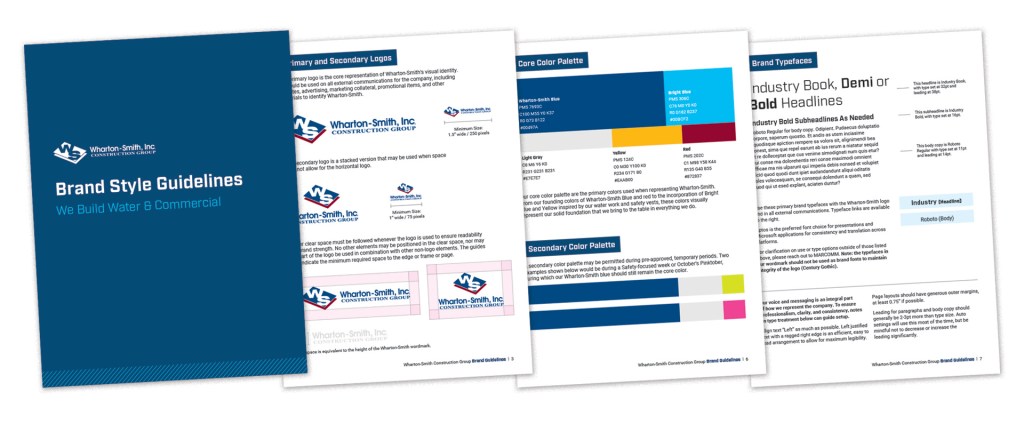
Building upon the logo refinement, our brand guidelines were updated to ensure clarity around logo usage, color palettes, type treatment, and applications of our brand in apparel and promotional items, job site application, and more.
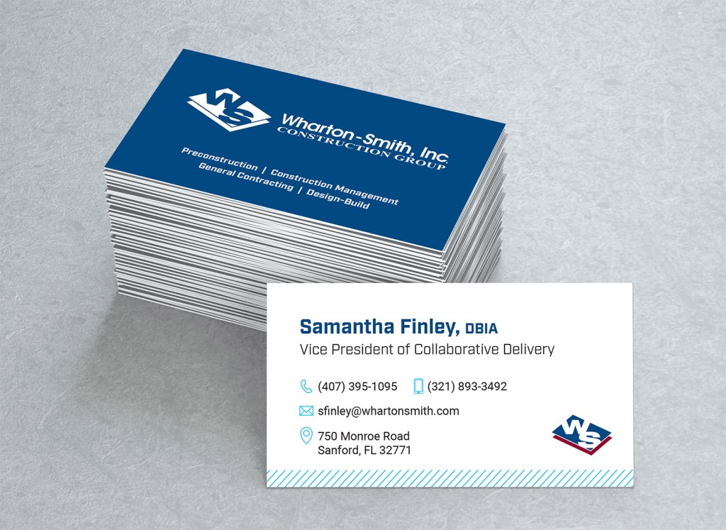
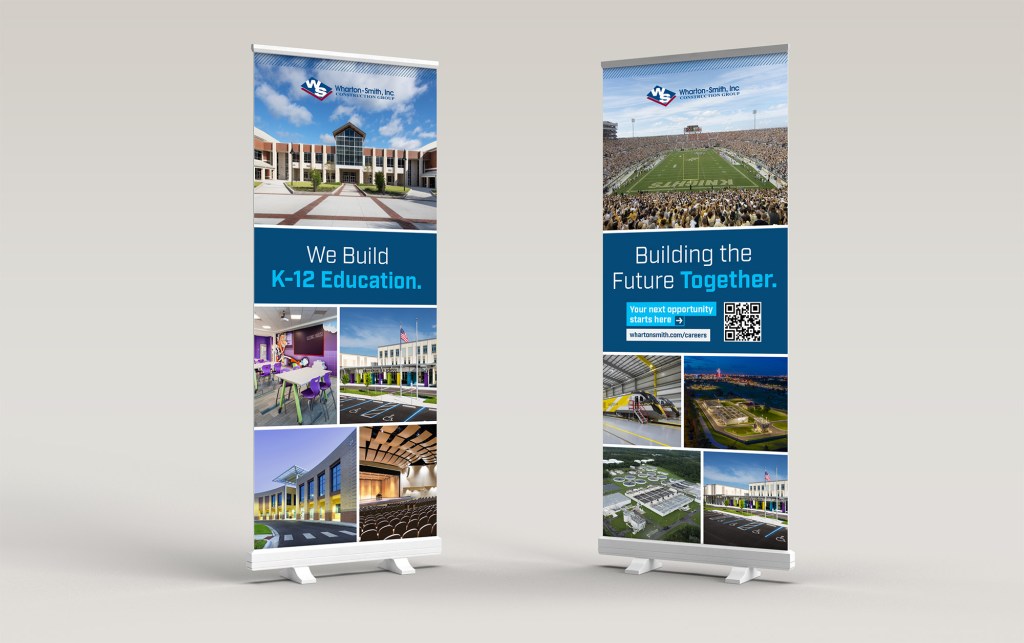
The front line of supporting collateral was refreshed so our encounters with current clients, future clients, and industry partners were visual representations of the underlying driver – that every. single. thing. we do contributes to our brand and conveys us as the industry leaders we are.
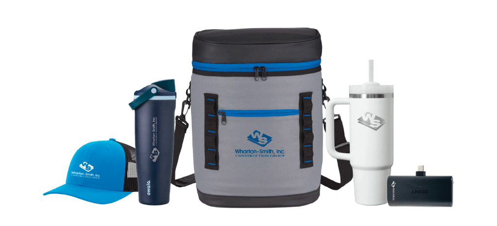
Supporting these initial touch points prompted the initiative to transition company store vendors, allowing for a wide range of elevated products available for industry events, client gifts, and employee distribution. Externally, we need to reinforce the relationship-building efforts within the community and audiences we serve. Internally, our employees are proud to rep our brand.
We’ve also been slowly transitioning our internal communication tools to reflect the brand refresh. By consolidating and streamlining the information we’re conveying to new and current employees, it furthers the focus on the culture built around our brand repuatation.